
Guiding insurance buyers with simple website functionality
Challenge
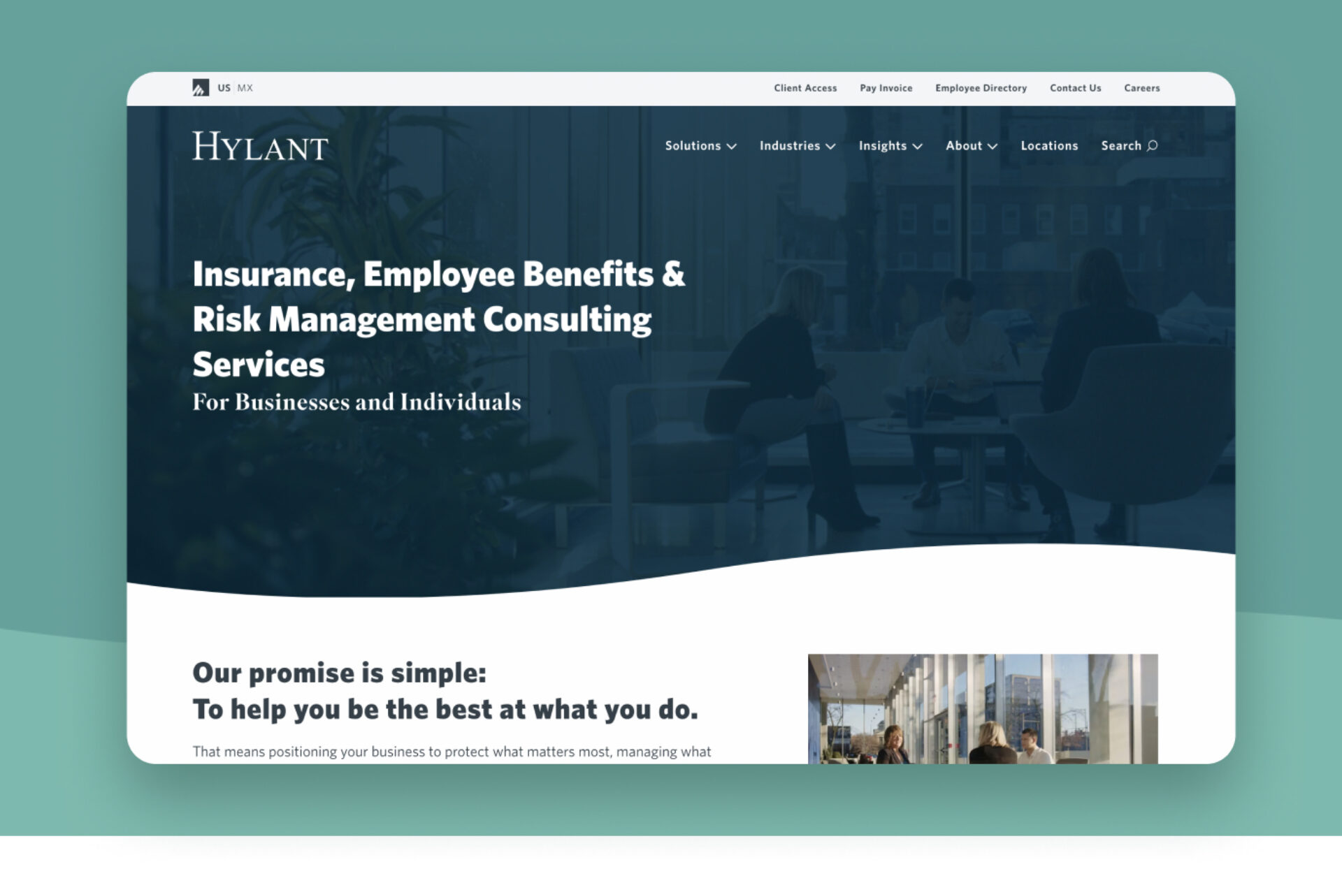
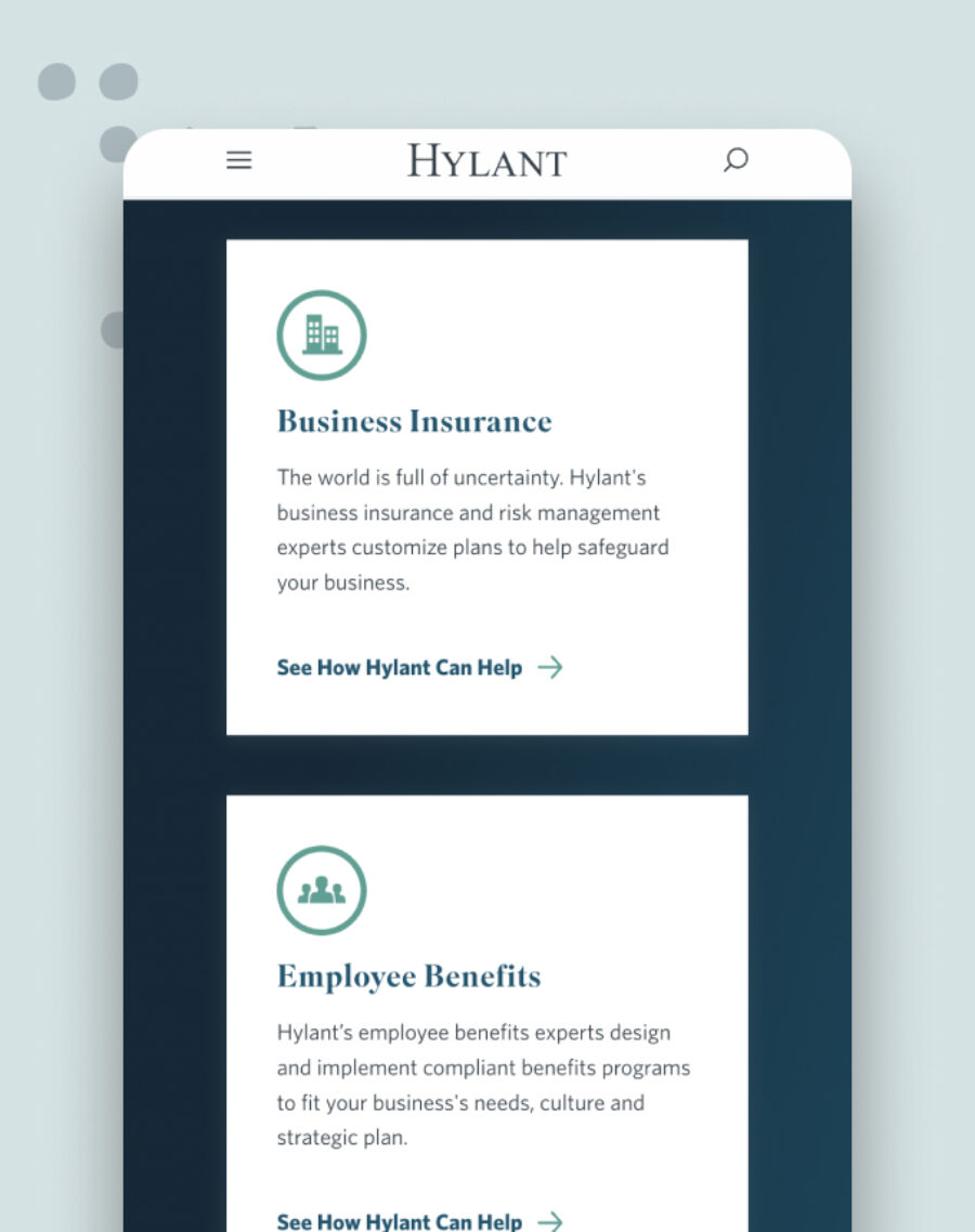
Hylant needed a unified website experience that could guide both commercial and personal insurance buyers across a wide range of coverage options, from employee benefits to personal property without overwhelming them.
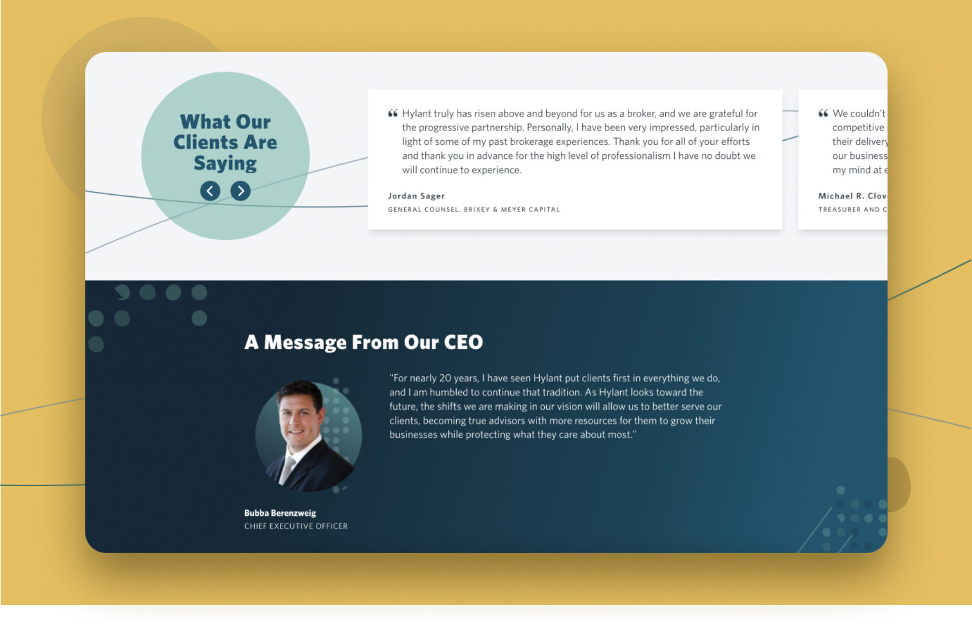
With multiple user journeys spread across microsites and landing pages, the challenge was to create a scalable, authoritative platform that functioned like a digital sales representative, connecting users to the right products at the right time. Above all, the site needed to support sales teams, strengthen brand authority, and generate new leads through clear, focused experiences.
Solution
Based on in-depth user testing and website analytics, we knew we needed to make it easier — and faster — to complete key actions, such as getting a quote. We approached this in two ways: implementing a more modern, guided navigation and adjusting the site’s architecture to support SEO-related priorities, like providing optimized experiences to visitors who reach the site via non-branded keyword searches.
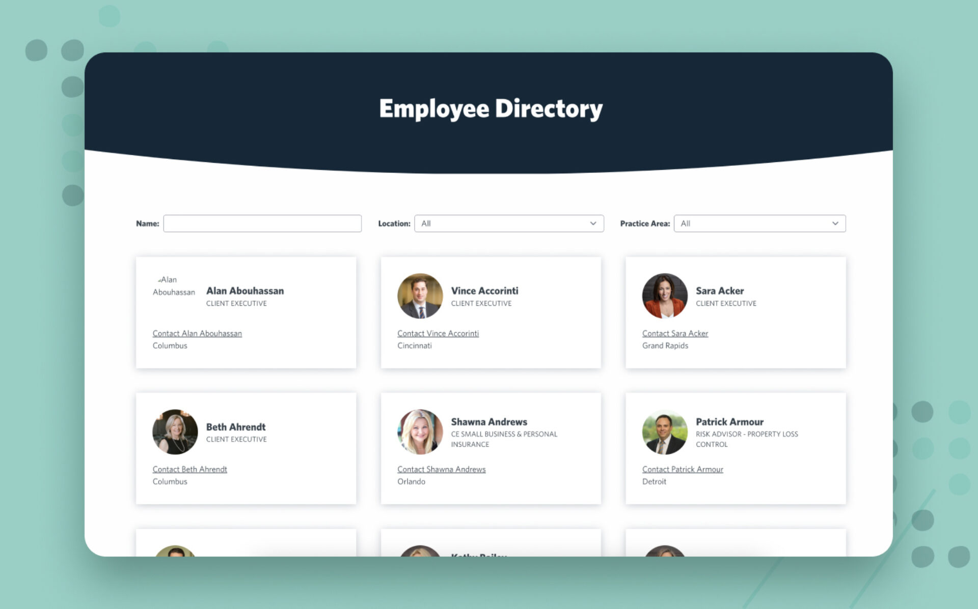
In addition, we enhanced site search functionality with built-in features like auto-fill, typo tolerance, and machine learning — making it a snap for customers to find specific resources. And, based on customer interviews that indicated the value of a personal connection with Hylant’s team, we added an employee directory to the site.
Results
Since launching in early 2023, the site has seen a 75% increase in traffic driven by non-branded searches — a major win toward Hylant’s goals of using the website to attract new leads and build brand authority.
We engage our creative, expert team to produce impactful videos that delight audiences and spur excitement.
Rebuilding digital experiences with purpose
A smarter foundation for growth
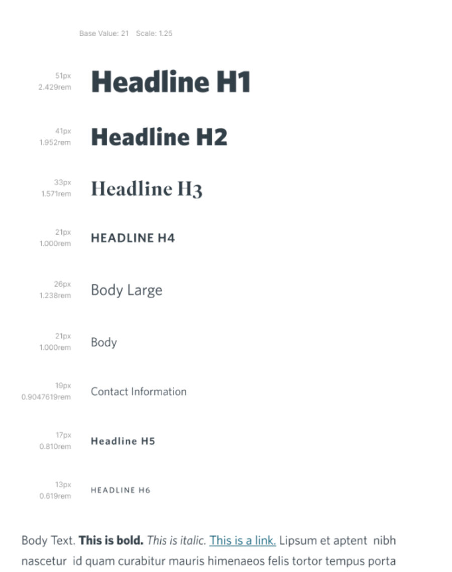
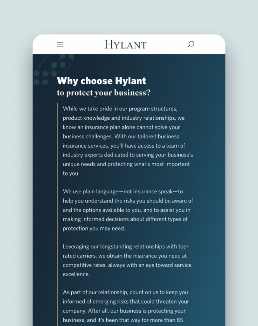
When a website no longer supports business goals, it’s time to rethink more than design. We rebuilt this digital experience from the ground up, aligning brand strategy, user needs, and modern technology to create a scalable, conversion-ready platform. The result is a site that guides users with clarity, supports internal teams, and delivers measurable impact that is built to perform today and adapt for what’s next.

